
Archive ☽︎
SCYTHEISIZER
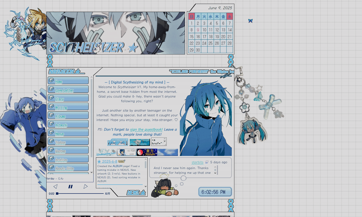 V1
V1
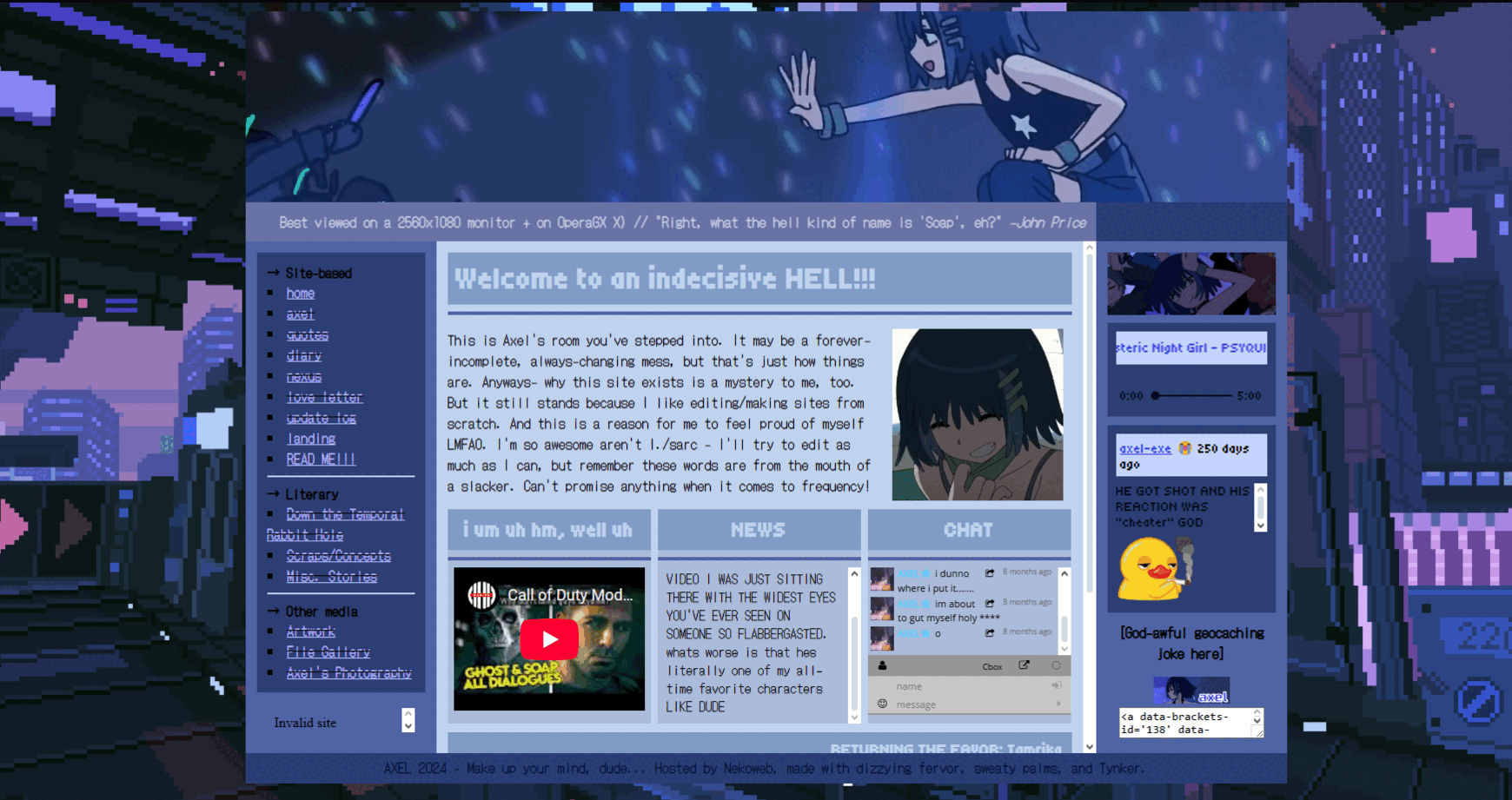
HERE WE ARE! This is the current version of the site as of 2025-6-9 (happy Rockman Day!). I actually really like this one and I don't intend on letting it go any time soon. Two months and counting! My favorite part is. The whole thing sorry. Its just really pretty. I like the ENE but I've slightly lost interest in Kagepro since then. I hope I can get more volumes for the manga soon!
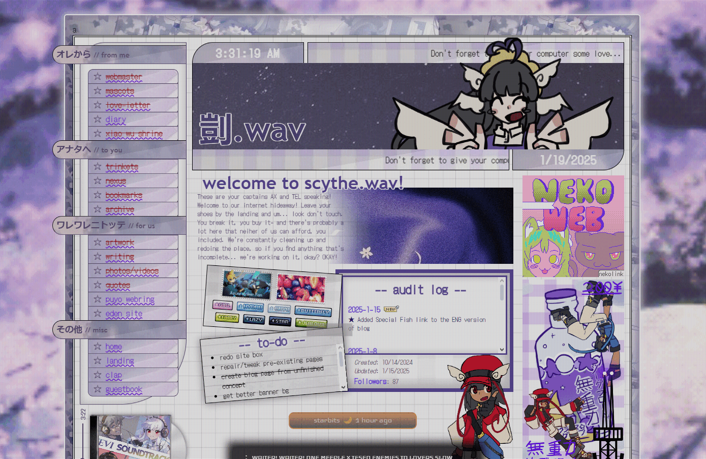
SCYTHE.WAV
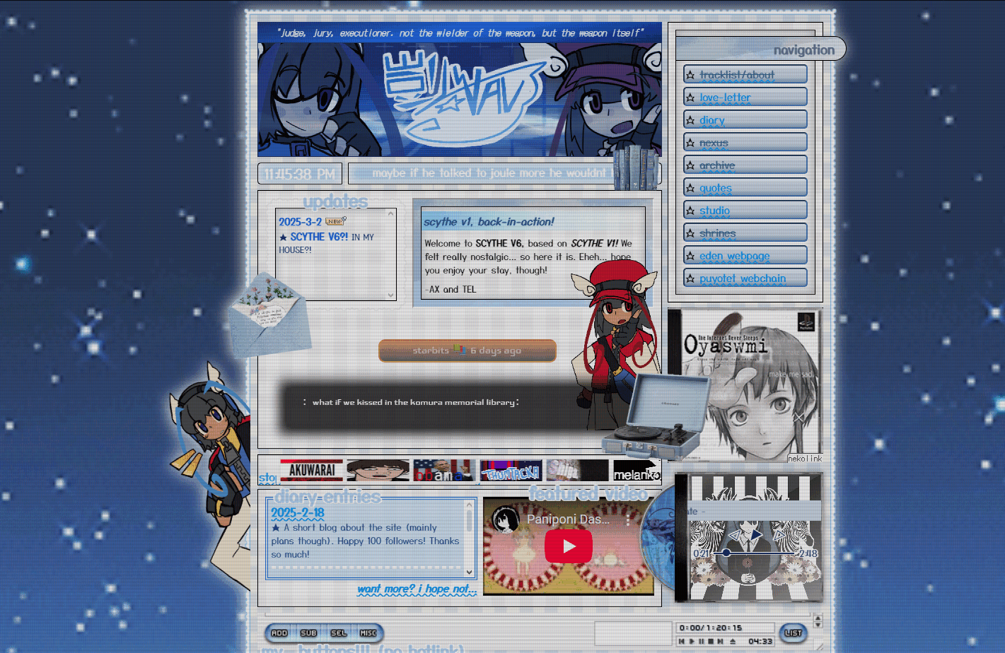 V6
V6
The last Scythe.wav iteration before the reboot. It's based off V1/V2 and I'd say it does it justice. I mean it doesnt come close to peak (v2) but this works. Hi Copenrika
 V5
V5
I retired V4 because of the bottom half and replaced it with this thing I made at schoolREALLY??? its pretty and all but something about it makes me not like it as much as the others. it just. pisses me off and i haveNO IDEA WHY. my favorite part is the top part though (before nav)
 V4
V4
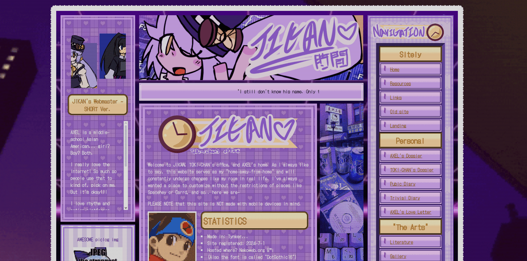
Angela Hikaru de la Croix is DEAD. I didn't like her so I just redid her and left the Scythe.wav-ing to the (then) Ortega twins. This one is really pretty but I vividly remember giving up on the second half (after part with nav). This is also the only iteration in all of my webmaster history with a drawbox. I'm planning to bring it back though. Just with Nekoweb's drawbox instead of Poyoweb's.
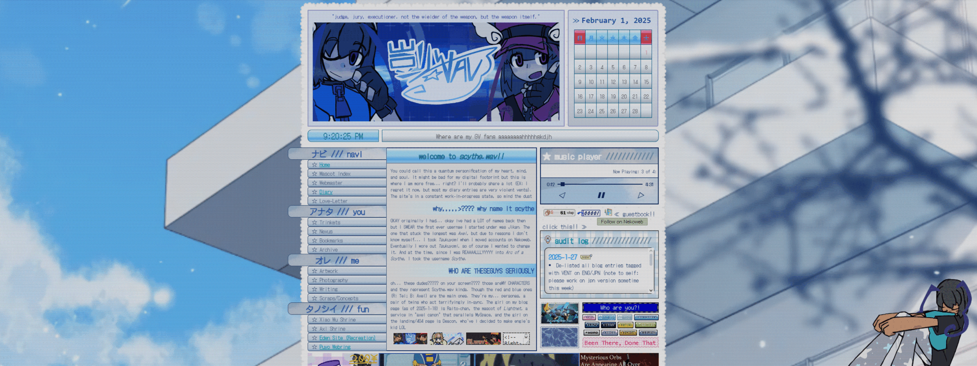
 V3
V3
...okay, looking at it now, I guess the reason why V2 was retired was to make way for Angela Hikaru de la Croix (NOT ANGELA ORTEGA). It's wider than V2, generally uses three columns instead of two, and its PURPLE. My favorite part is the chat box. I feel really weird whenever I hear the Peacekeepers HQ theme when I play TEVI now though.
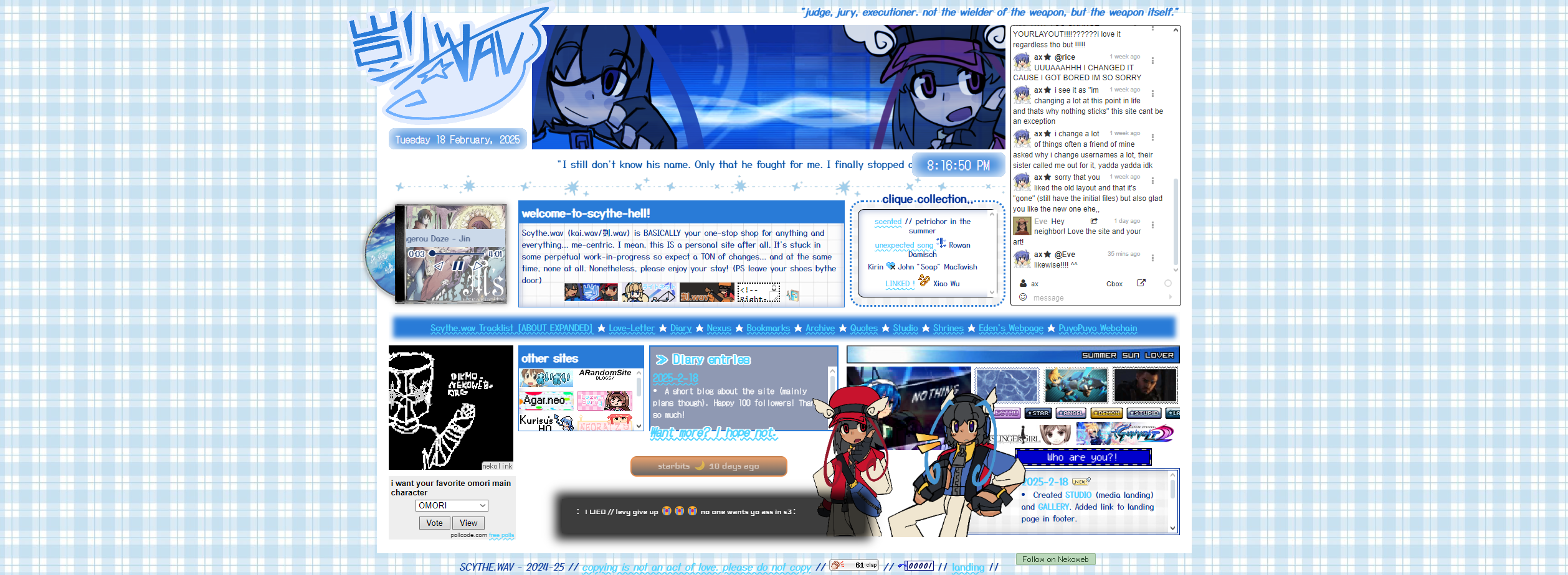
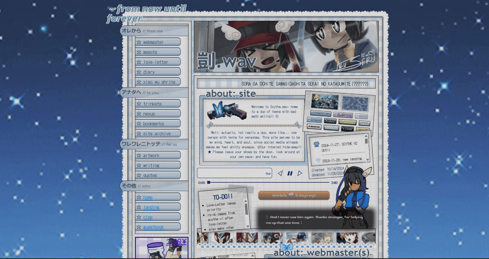 V2
V2
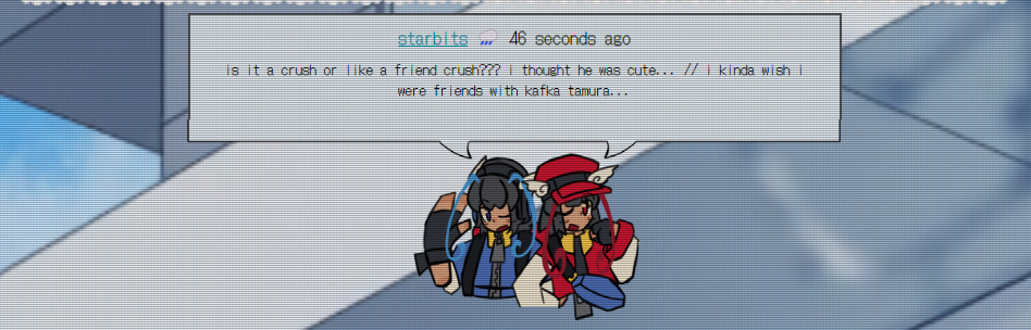
I made this version after creating Axel's (at the time) twin sibling Tel. This one is actually my favorite version from the Scythe.wav... era... and I honestly don't know why it was retired? ITS SO BEAUTIFUL. So much going on while still being functional, the whole general feel is just... really nice and nostalgic for whatever reason, and its just really cute! My favorite part is the top part (divided by the stamp marquee) and Gunvolt running by on the bottom with Lumen.
 V1
V1
The first iteration of uh. Scythe.wav yeah. It's kinda simple and slightly compact and I love it for that. I especially adore the navigation and... the specific style this page, and all of the other pages I made while this version was active was really charming and distinct to me.
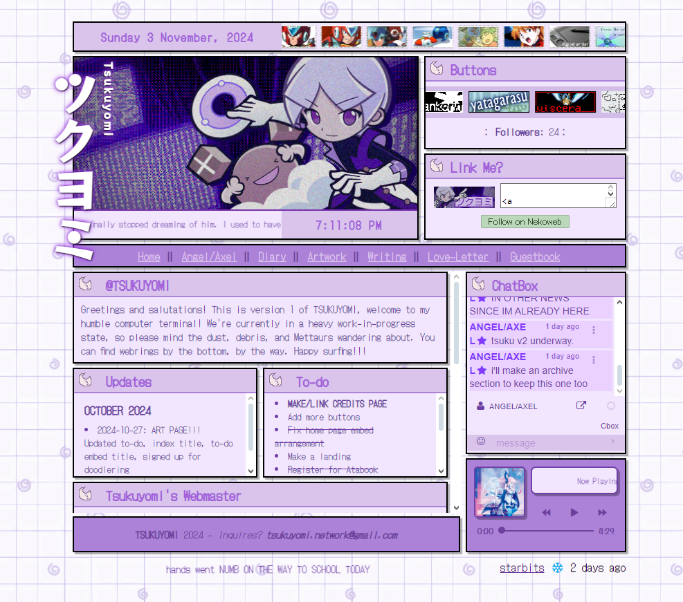
ツクヨミ
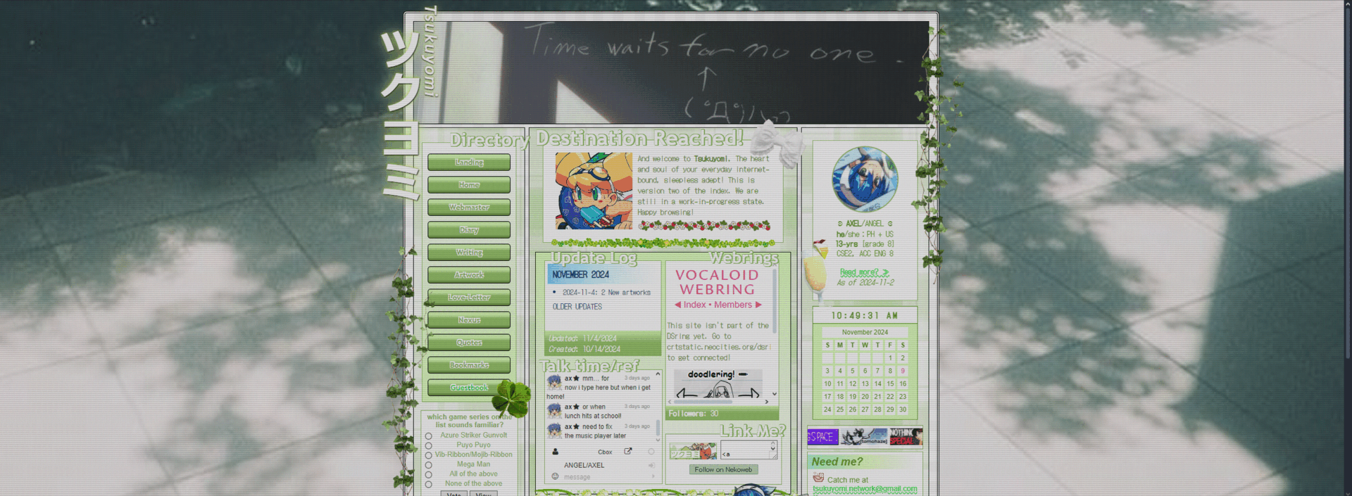 V2
V2
This one's really pretty!! I guess part of the reason why it was retired is the middle part (it felt too cluttered to me at the time) but other than that, this one's really good! My favorite part is the right column. I'm pretty sure this was also inspired by an older version of viscera.nekoweb.
 V1
V1
Inspired by yatagarasu.nekoweb. I'm not really a fan of the style but at the same time I kind of am...? It's okay I guess. My favorite part is what I did with the top part (before nav)
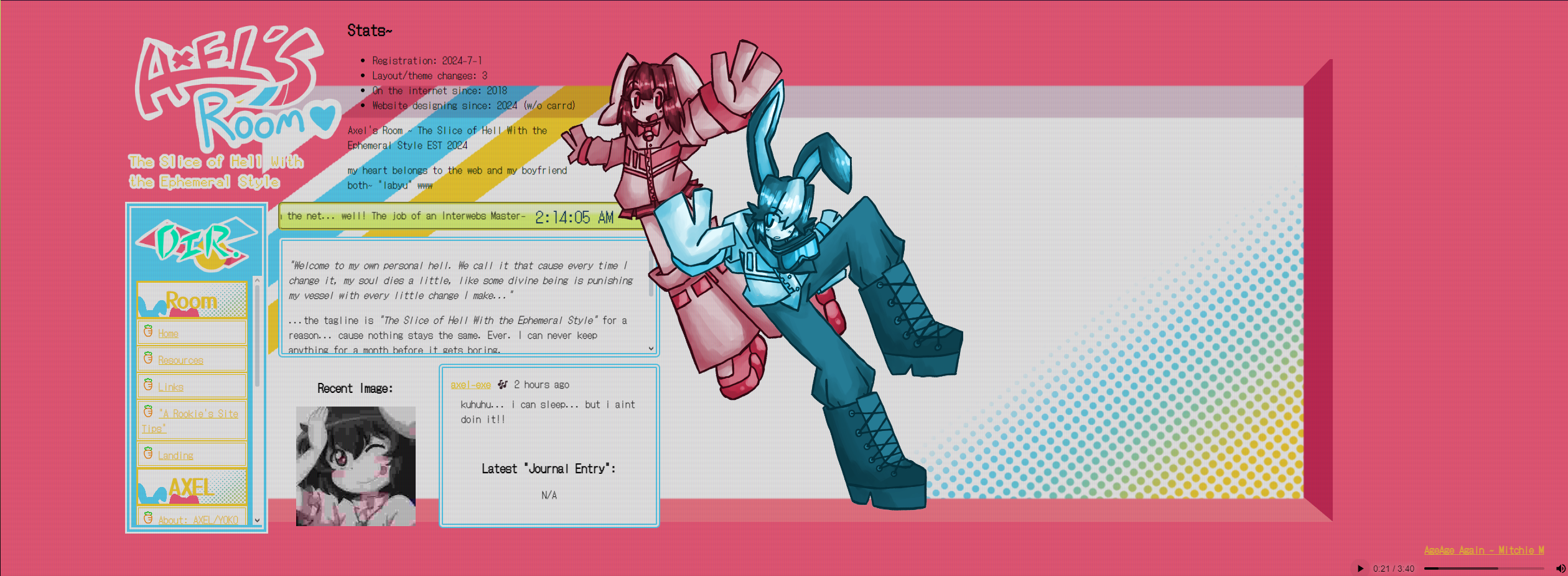
Axel
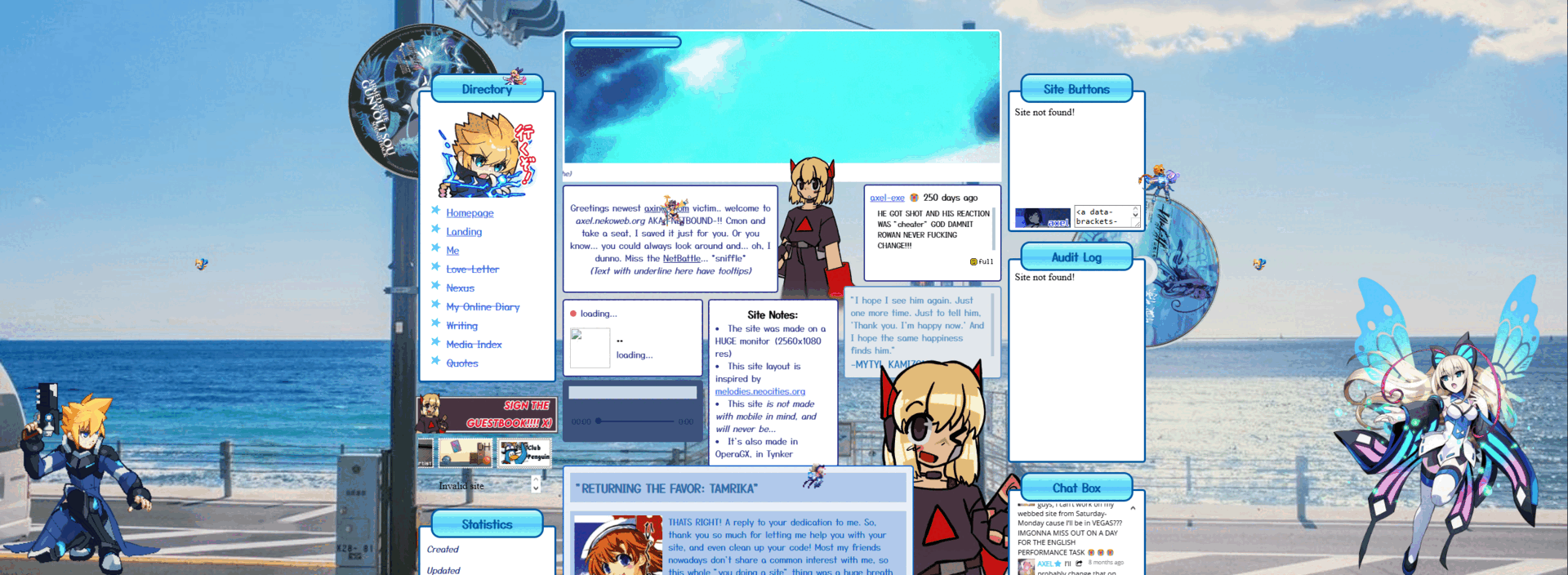 V7
V7
This isn't the last version of Axel's Room/Netbound, but its the last one I COULD FIND. I actually hate this one. Its cluttered in a bad way. Also Maroon was RED and the theme was BLUE. COME ON.
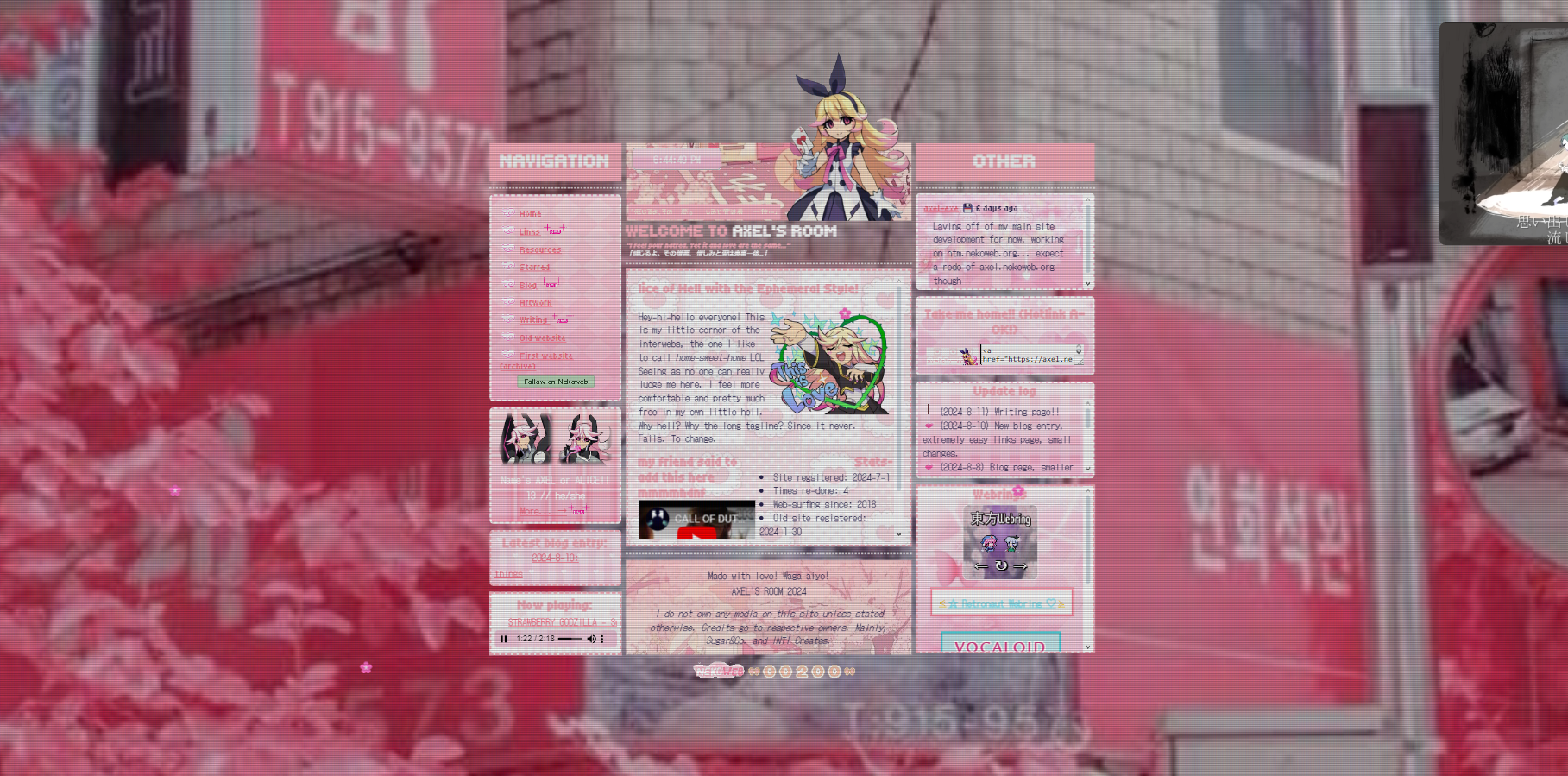 V4
V4
this is the best one ive ever seen from the axel era. actually if i had to list all of my site designs from best to worst this would be RIGHT BELOW SCYTHE.WAV V2. LORD IS IT PRETTY. its also like my only pink homepage. My only complaint is the small iframe in the center that would have all the pages inside it but its okay besides that. My favorite part is the Zonda banner I had to put together.
 V3
V3
I liked this one too, I thought it was cute. This is one of the only axel-era pages to have the page NOT centered and I love it. A later version had the American flag in the corner cause my ex told me to add it. It's really simple but its so cute!!
 V???
V???
This one wasn't even labeled. I don't know what version this was, but I know it was when I had the axel username for Nekoweb. It kind of annoys me. A lot of it does. It looks too clean and yet its too messy for me too. The worst offender of this mediocre layout is the black text. Just straight up black. Not a darker shade of blueNO. IT LOOKS SO BAD.
Before-Axel
 Toki-Chan's Office
This one reminds me of July because this is one of my first layouts from when I moved to Nekoweb... in July. It's wide, purple, and I guess its cute. Nothing special in my opinion. Toki Honma does all the heavy lifting here. If she weren't here the site would be less than subpar.
Neocities
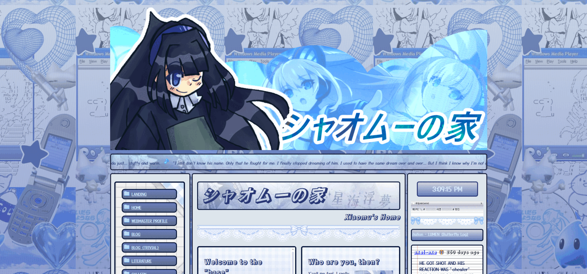 Xiaomu no Heya (Xiaomu's Room)
(Image link is the actual site) The last Neocities layout I'll ever had. Its bad. By my standards at least. Its weirdly plain and simple. I just. Hate this. My favorite part is the navigation.
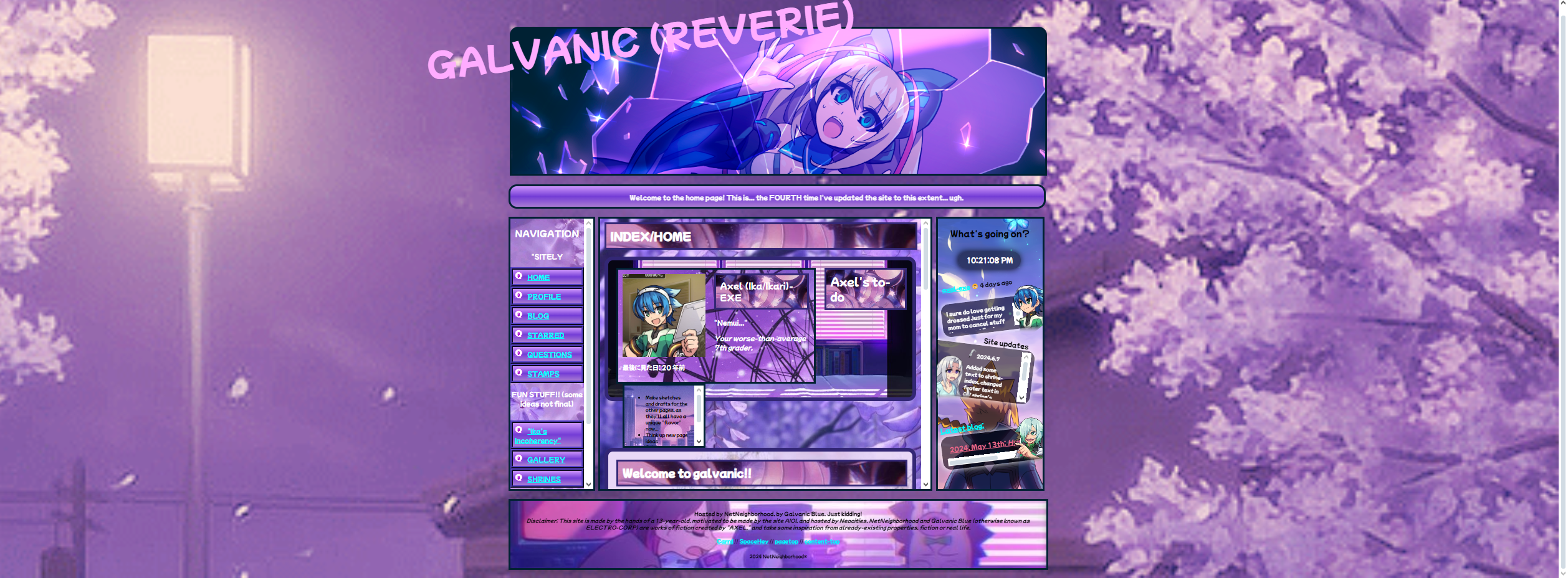 Galvanic
I liked the naming conventions of this one. Each page was themed after a Gunvolt character, and the names of the pages would be a word that relates to the character. The heavy image-background usage is a crime though. My favorite part is the stuff on the right column and how it looks like the Gunvolt 1/2 dialog boxes.
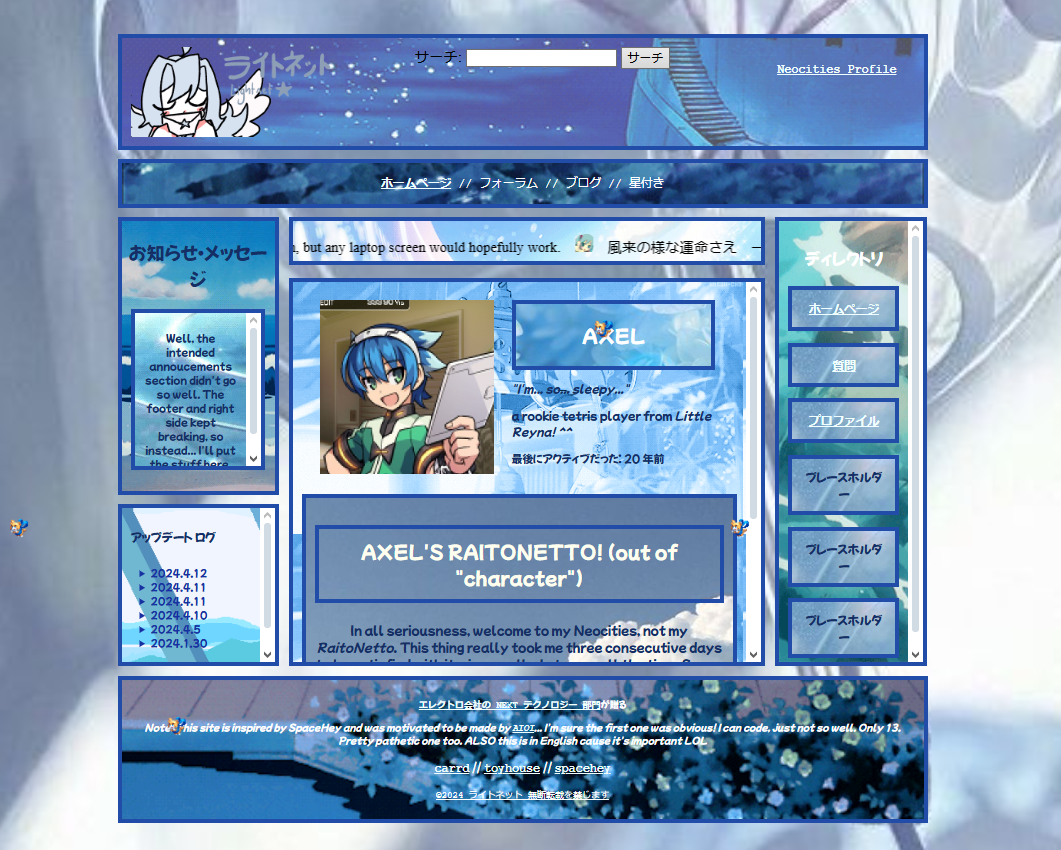 ライトネット (Lightnet)
(Image link is the actual site) Did you know I've never used a site template in my LIFE? This is my first layout. It was made with heavy use of float and margin (I didnt know how to use grid-template-columns yet). This is actually really good for a first site, I think? The over-use of background images gives it a kind of charm I couldn't replicate without using them. I wish I saved the whole site. It was cute...